Following on from Mike O'Driscoll's post on how we can make better use of statistical packages such as R in analysing data, friend of #DefraData, Sarah Wong, applies data science to the classic question: what's the price of milk?
Sarah Wong is a recent graduate from the University of Southampton's Data Science course
Data science is not just about data, but the ability to ask the right questions and using analytical insight and context to interrogate what the data is telling you. you gained into actions.
Data science combines skills from many professions programmers, scientists, or statisticians. On one level, it's what people do unconsciously every day: collecting and receiving information; cleansing and filtering out what is not important or out of place; processing and analysing to draw conclusions; and sharing insights with others.
The Southampton Data Science course that I recently embarked on with Defra categorises these activities as: Data Collection and Management; Data Analysis; and Data Visualization. Whether data is on earth observations, river levels, or diet (all applicable in Defra), that data tends to always go through these three stages in one form or another.
Below is a summary of what I learned on the course:
- Data Collection and Management
The four characteristics of big data are their volume, variety, velocity, and veracity. The approach we take to data collection and management is influenced by each of these characteristics. Variety stems from the wide range of sources and formats data can come in – for Defra, this range is huge. For example, data can be collected from surveys or physical sensors eg. farm statistics, pollution levels and LiDAR data; and can be accessed in different ways, such as primary collection, application programme interfaces (APIs), or data mining from the internet. They can be discrete like the location and owner of pollution incidences, or continuous like levels of emission, structured like tabulated measurements, or unstructured like interview responses with stakeholders. These different characteristics determine the tools used to collect and manage them.
'Veracity' describes the quality of data including its accuracy, noise levels, and any discrepancies. Before carrying out any analysis, raw data needs to be checked for discrepancies, biases, duplicates, gaps, and filtered for noises. It also needs to be consistently reformatted for integration into coherent sets of data. Besides assessing quality and preparing formats of data for use, considerations should also be made as to whether the right data is being collected, and any limitations in the methodologies of collection. There is no point doing analysis on the wrong sets of data! Refer to the Data Principles to see how we ensure the quality of data we use in Defra.
The Volume and Velocity of data means sufficient processing power and computational infrastructure are needed to support the use of these data. Defra’s Earth Observation Centre of Excellcence, for examples, can handle and process large amounts of satellite imagery and data, and plays an important role in processing the data for Defra group so that it is analysis-ready.
- Data analysis
As David Lee has written elsewhere on this blog, data analysis is the real challenge that faces Defra. Data analysis draws observations from within or across sets of data. Looking at the data we have, we can apply statistical analyses such as mean, standard deviation, and distribution; spot trends in time-series data; do probabilistic modelling, carry out regression analysis, and use machine learning to predict outcomes based on incoming data. For example, spotting quality of water sources based on image analysis of earth observatory data, and forecasting air pollution levels under different intervention scenarios. Analyses could be carried out on the whole population of data where observations need to be made, or on samples that represent the population.
Interpretation of data requires deeper insights and understanding then just the statistical processing of numbers themselves – Anscombe’s quartet is a classic demonstration of the importance of contextualization and visualization of data before analysis.
- Data visualization
Visualisation is about more than just graphs though – it’s about telling the story to the intended audience. Edward Tufte in his book 'The Visual Display of Quantitative Information' shows us how we can tell stories with data by adjusting visual cues around plotted areas, such as the size, position, orientation, colour and scale of pointers. Studies on perception and visual tricks found that humans are more receptive to colours and shades than shapes. A theory of perception in psychology called Gestalt Theory also explores human’s tendency to group objects by proximity (eg. bars close together in chart), similarity (eg. repetition of color pattern in each group), connectedness (eg. links between data points within group), continuity (ie smooth connection between associated data points), and closure (ie. bounds or box around parts of chart). These insights to human perception can be used to facilitate more effective communication.
Effective storytelling also requires knowing your audience, the outcome of your analyses, and the intended actions for viewers. There are different approaches to telling stories: 1) Exploratory (user-driven): where comprehensive datasets are provided to users, who extract information and find their own stories, and 2) Explanatory (author-driven): where the objective is to communicate stories already found during analyses, and the story told with minimal chart junk to convey key messages (‘Give the most information with the least amount of ink’ is one of Edward Tufte’s central theses). Data scientists need to use these tools, visual tricks, and psychological understanding to effectively communicate their work and inspire desired actions among the viewers
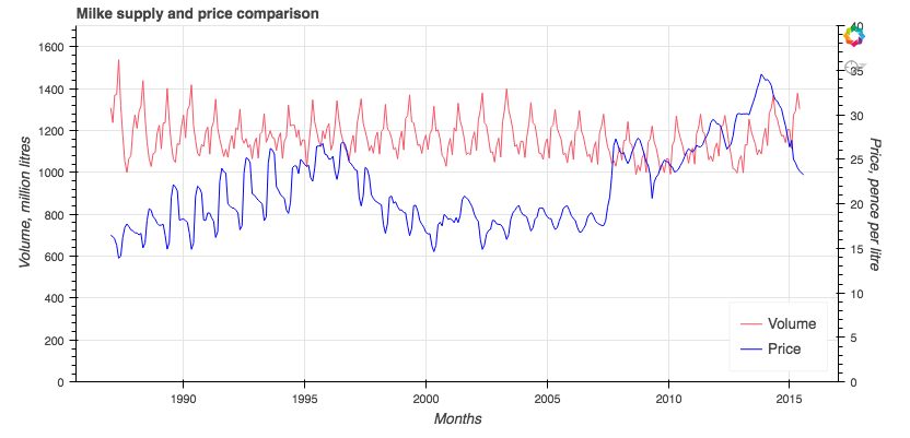
The price of milk
To test out these principles from the Data Science course, I looked at Defra’s data on farm-gate milk price as an example. The price of milk is subject to a range of interplaying factors. On the supply side, the industry output (influenced by herd size and its productivity), cost of production, level of import and export, as well as presence of any quotas determine the amount of milk available on the market. On the other side, changing domestic and international consumption of liquid milk and milk products determine the level of demand in the market. Power balances between dominant supermarkets and supplier cooperation can also distort price. To investigate the interplays between these factors, I collated milk price and output data from Defra’s open dataset and visualized them in Python Bokeh for users exploration. If time allows, a lot more could be added to the visualization to identify where the stories lie, and where there are potentials for policy change.
Recent Comments