Defra's guidance helps people comply with the law, but people use it because they have a task to complete. Whether it's labelling food products or applying for a grant, a user's task is always broader than just knowing what the legislation says.
The Smarter Guidance project is making Defra's guidance clearer and more targeted so that people can use it confidently, complete their task and get on with their lives.
How people read online
One of the great things about the web is that so much of people’s behaviour is measurable. We know a lot about the science of how people interact with content. Things like how many will ‘bounce’ off a web page after only reading a couple of words, how many are likely to scroll down, where they go next in their journey, and much more.
We know that people don’t read web content line by line, word for word. Eye tracking studies show that people scan read and flick over web pages, often without realising it. They’re looking for clues that tell them whether a page is likely to give them what they’re looking for, and where in the page that crucial information is.
In the past, online guidance has followed quite a traditional structure: the old ‘tell them what you’re going to tell them, ‘tell them’ and then ‘tell them what you told them’ model. That doesn’t work for online content – we structure pages according to how people actually consume information online.
Give users what they need up front
We always start with user needs (who’s going to use this guidance, what they’re trying to do right now and what their ultimate goal is).
If we know what users are trying to achieve when they arrive at a piece of guidance, we can structure the page to help them complete their task quickly and easily. This is called the ‘inverted pyramid’ – the meaty, important bits are all towards the top of the guide.
Previously a piece of guidance on a grant might have been structured like this:
- Background
- When to apply
- Who can apply
- What happens after you apply
- How to complain
- What grants you can apply for
- Apply
But with this order, the stuff users really want to get at is buried. A content designer would prioritise these sections so the things we know users really want appear higher up.
- What grants you can apply for
- Who can apply
- Apply
- When to apply
- What happens after you apply
- How to complain
- Background – this is less useful for the task users are trying to complete here, so we'd probably remove it completely
It might at first seem logical to structure content chronologically, according to the steps in a process. But we think about the user’s thought processes, what they want from the guidance before they decide whether to invest time reading it. This way, users don’t get frustrated and give up – we’ve created shortcuts for them.
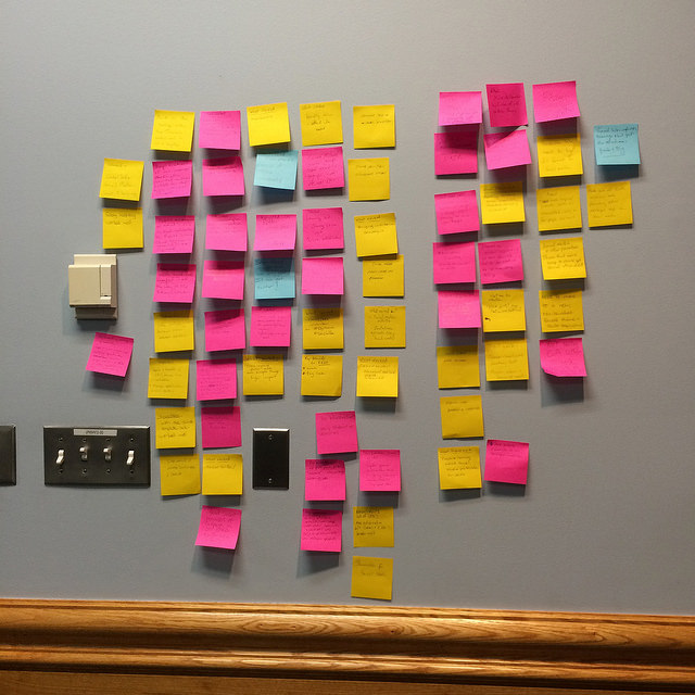
Step back, think about users’ priorities
We often use sticky notes or index cards to help us think from the user’s point of view. This approach works for ordering sections within individual pages, and structuring lots of related pieces of guidance. Even at a really granular level, like the order of a list on a page, we’d look at data from user statistics to work out users’ priorities, rather than using alphabetical order.
As well as starting with user needs, we think about them in the middle of the process and end with them too. So we might try a few scenarios out, whittle down some options and settle our thinking by choosing the approach that would be most helpful to our users. After we hit the big green 'publish' button, we'll get even more real life data on how people are interacting with the content, so we can always keep improving.
Follow Kate on Twitter: @kate_evans.
Recent Comments