When producing Defra’s Smarter Guidance for GOV.UK, some people ask: ‘how long should we make this guide?’
The shortest guide I’ve seen was a single url. The longest was 40,000 words. These examples don’t show the acceptable range of a guide’s length. They show how badly some editors have got it wrong.
A guide is the right length when it explains to the user:
- how they can complete their task
- what happens if they don’t complete their task
- what they might need to do after they’ve completed their task
Guides don’t need an introduction
Speaking at the 2015 User Assistance Europe conference, web usability expert Steve Krug proposed: "no one under the age of 30 will read something called overview or introduction."
At GOV.UK we’d agree.
What about users over 30? Well, we could write introductions to our guidance, but we’d be wasting their time.
The goal is to let users know if they’re on the right page. If you write a clear title and summary, you don’t need an introduction.
In fact, 3 years ago all guides on GOV.UK had introductions. But user research found that an introduction got in the way of users completing their tasks - so the introductions were dropped.
Write guidance based on user needs
We write Smarter Guidance based on user needs so users can complete tasks simply and quickly.
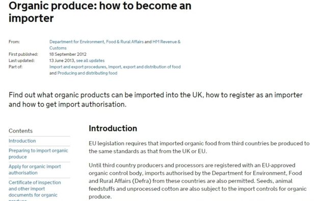
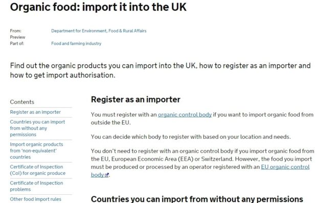
I recently edited a guide on importing organic food. I found that very little of the original guide met user needs.
By rewriting it based on user needs and dropping the introduction, the word count fell from 2,700 words to 500 words.


This example doesn’t mean 500 words is the right length for guides. It means 500 words was the right length for this guide: user needs are met and background information (‘noise’) is left out.
Think about user needs, not government needs
When we write for users rather than to fulfill the needs of government, our guides become shorter.
The original importing organic food guide included a ‘further information’ section that gave the user 13 different website urls to look at. Only 2 of those links had any context so the user would know why they might need them.
More importantly, none of the links helped the user complete their journey. Using a further information section as a dumping ground for links in this confusing way is meeting a government need and not a user need.
In all our guidance, we only need to include information that helps the user do what they need to do.
You very rarely need a further information section.
Further information
See? I’m wasting your time now.
Recent Comments