Minimum viable products (MVPs) are a hugely important part of service development. By aiming to release as early as possible you reduce the risk of never releasing at all. You also get valuable feedback from users using the system in a real world situation. No amount of analysis and user testing can compare to that.
As a Delivery Manager, I’ve always found it hard to get teams to work coherently towards an MVP. There is often a concern that developing an MVP is less about prioritising work and more about dropping features.
Even once you’ve moved past this, it’s essential that the team’s Product Manager has a really clear vision, and communicates that clearly to the rest of the team. Then the whole team needs to be able to support the Product Manager in simplifying it further.
Whilst developing a service to allow people to apply for permits for handling waste online, we were struggling with exactly this problem. There was a lack of clarity between the Product Manager and the team on what was in and out of scope for our MVP.
This meant that we ended up working on features that wouldn’t be required until later iterations of our service. We had laid out the plan for the MVP using an online tool for managing your backlog, and a Kanban board. But neither of these was as visible to everyone as they should have been, so they weren’t kept up to date, which meant they weren’t referred to often, which left them further out of date. They also didn’t really support the team in simplifying the MVP once we had our initial vision.
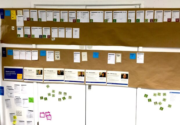
We put our MVP on a wall
Our initial release planned to support 55 different types of applications for waste permits. That required 72 separate web pages, not all of them required for all the application types.
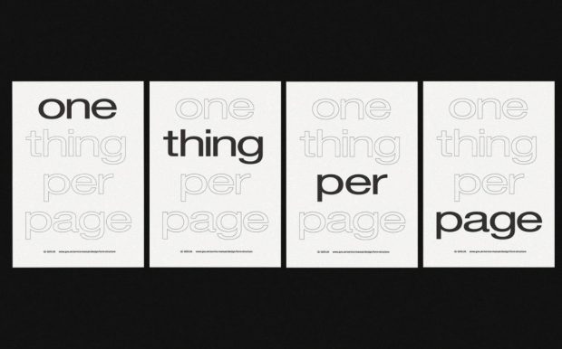
Keeping in mind the principle of “one thing per page”, we started to re-think the MVP by printing out every one of those 72 pages and sticking them on a wall. We put them in the rough order that they would be completed as part of the application process. It was immediately clear we had a lot of work to do.
The team wanted to try and show our Product Manager how we could do less and still provide something of value. We took the simplest permit type, only looked at one payment option, and pulled out a few other things that weren’t absolutely required to complete an application. We then put these screens on the wall underneath the full process, to show how much less we could do. We managed to reduce 72 pages to 22 pages, while still being able to provide a permit.
While this was much simpler, it only catered for about 10% of applications, which wasn’t really enough for a “viable” MVP. So we did more iterating, adding more screens as a third row of paper sheets on the wall.
The result was a web service made up of just 32 pages, catering for about 95% of applications. That was more like it.
A clearer vision means a happier team
Our Product Manager was sold. He didn’t agree with every decision we made, but he loved the idea. He worked with the rest of the team to include functionality he thought was crucial, but simplifying other screens in ways the team hadn’t thought of.
The final tally was 26 screens for the most basic permit application, and 42 screens to cover 95% of applications. Everyone was happy.
From this we suddenly had absolute clarity about what we should be working on. Our Product Manager’s vision was on a wall, and so non-MVP work stopped immediately. We also had a vastly simpler MVP, meaning we’d brought forward our expected release date by 2 months. Best of all we’d done all of this without significantly reducing the functionality we were offering.
Iterating what works
Not happy to rest on our laurels, we tried to improve our visualisation. Using different rows of print-outs helped us sell the approach and simplify the MVP, but now the wall felt too crowded. So we removed the 72-page “full service” visualisation, and moved the 26-page MVP to the top.
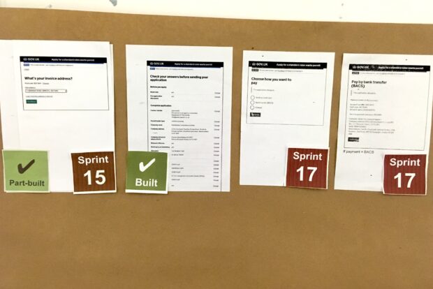
Now, the visualisation became a progress bar. We added green sticky notes to pages as we built them, which made it really clear how much work was left to do
'Showing the thing' helps
Having a clear vision for a truly minimum MVP is a crucial but difficult part of software development. Communicating that vision is even harder. Being creative with ways of laying out this vision can really help with this.
As it turned out, and without any of us realising that we were doing it, we were 'showing the thing'. Creative communication helped us show the right people what was on our minds about the nature of the problem and possible ways to fix it.
If you’re struggling with the traditional backlog-and-Kanban board approach to laying out the vision, don’t be afraid to try something a bit more creative. For us, it worked wonders.
2 comments
Comment by D posted on
Fantastic idea - and beautifully simple. More teams should do this, my own included.
Comment by James posted on
Nice one David 🙂
No complicated system, process, software etc...
Just paper, a wall, and the team.