I’m an interaction designer working on the check for flooding service (currently in Beta). The service makes extensive use of geographic information and this blog covers some of the work we have been doing to make our maps more accessible.
Addressing severely impaired eyesight is a challenge but there are many users who are unnecessarily excluded from using interactive maps. For example, users with Parkinson’s or arthritis can find it difficult to use a mouse and often prefer to use a keyboard. Interactive maps however, typically rely on mouse or touch interfaces.
Our challenge is to make essential geographic information accessible to all and to make interactive maps work for as many as possible.
Where do we start
So where do we start? It must be for people who can’t use a visual interface. Perhaps not what you’d expect from a blog about maps but for many users there may be a more effective way to present geographic information. For example, someone using a screen reader or a voice only interface such as Alexa?
A few years ago I watched a presentation by Derek Featherstone (from 16:05), a renowned accessibility expert. Derek stresses that if we think about why we are presenting something, not what we are presenting then it opens up other possible solutions.
Most users of the Check for flooding service need to know if and when they might be impacted by flooding. Using this principle by obtaining the user’s location of interest we can use the data to describe the local flood risk in words. This would provide the core information to all without a map in sight.
Presenting geographic features in a list using names or descriptions can help locate them. Using search and filter options can further help refine the relevant information.
As a starting principle for any data visualisation project, all essential geographic information must be available in non visual formats such as a text description or a list of features. Maps should be used as a visual enhancement of this information for people who choose to use them. Interactive maps should only be used when there is a user need.
Simplifying a complex proposition
However this blog is about maps and as we know maps, for many, are the interface they expect to use for locating and understanding geographic information.
Maps are a complex proposition for most users let alone those with limited digital skills. And being such a powerful visual element they have a black hole like effect of drawing all users in regardless of ability or need.
We found that by hiding the map initially didn’t have a significant impact on those that prefer maps while this helped those that don’t. This is not new, both Rightmove and Zoopla take this approach.

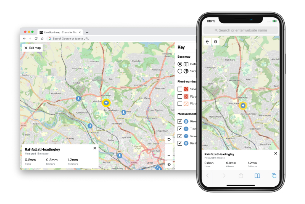
There is an added benefit too - providing invaluable context. In testing when users were initially presented with a map showing a flood warning area they were often confused as to what it meant. Many users assumed this was the area already under water. When presented with a text link titled ‘View map of the flood warning area’ users were more likely to interpret the area correctly the first time.
Showing one data set at the time would also help to reduce cognitive load. While additional data sets can be overlaid by those who need them. The act of simply reading a label and clicking a button helps with understanding before the features appear on the map.
We are also capitalising on learned behaviour. For example tapping a feature to reveal contextual information in an overlay located at the bottom of the screen is something many users are already familiar with. Think Google Maps. So we do the same - we’re not reinventing the wheel.
Keyboard users
Motor-skills impaired users, for example people with Parkinson’s or arthritis may struggle to use a mouse and can find it painful. In many cases they prefer to use a keyboard. Mapping frameworks typically only provide a mechanism to zoom and pan the map using a keyboard leaving the rest inaccessible.
We have ensured that every interaction that can be done with a mouse or touch interface can also be done with a keyboard.
With a map that can contain thousands of features this could be tricky. Tabbing through features one at a time to select the one of interest would be very frustrating to say the least.
We are trialling an approach where if you zoom into 9 or fewer features using the cursor and plus or minus keys we overlay a number corresponding to a keypress. This gives quick access to any feature overlaid on the map, just like a touch or mouse user would have. We also make this information available to screen readers and voice interfaces through use of an ‘aria-live’ region.
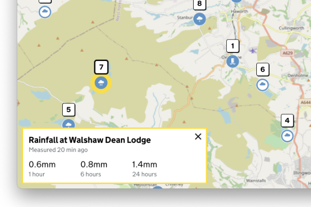
Just like navigating web pages with the keyboard it is crucial to identify which button or link has focus. We follow the same approach within the map so any buttons or window overlays that are in focus have a thick yellow outline.
Colour and contrast
The principle, don’t rely on colour to convey meaning, is tricky to follow with an interactive map especially when it comes to the map background. But there’s plenty we can do to improve things.
For the features we have control over, such as flood risk areas, we use unique hatched fills that can be differentiated by users who are colour blind. These fills are further enhanced with colour for those that can benefit.
For symbol features when you zoom in beyond a certain level each symbol enlarges and contains a unique graphic element, again not relying on colour to differentiate.

The map background poses more challenges as this is typically provided by a third party and out of our control. We are however exploring ways to customise the palette. By adjusting both the colour and contrast we can ensure optimal inclusivity. For example rivers are very important to our users so we can make these stand out at the expense of less important features such as the motorways.
Screen reader users
This is the holy grail. While the map is currently operable with a screen reader and there shouldn’t be any keyboard traps, its use is limited. If we could describe the location as the user moves around the map then this could add significant value. Using a technique called ‘reverse geocode’ we could obtain a place name from the map centre or using attributes from vector background data we could list features in the current view area. Both aspects we would plan to explore.
Testing with real users
Theory is great but testing with real users is key to ensure that we are making actual improvements. To help here we are using the services of the Digital Accessibility Centre (DAC), an organisation that specialises in making websites accessible. DAC user testers have disabilities and so know first-hand whether something is accessible or not. They provide invaluable expertise and advice on how and where we can improve.
One thing we’re learning is that there’s no single magic fix for a map but often different approaches are needed for different use cases. What may work on our service may not be optimal for others so testing with your service users is the key.
What next
There’s plenty more to do particularly around use of colour and the map background. So far we have only looked at maps for presenting geographic information. Capturing geographic information opens a whole new set of challenges. We also need to improve how we share and document what is working so far.
Do we need a formal pattern or component for a map? I’m not sure, it could restrict flexibility but a set of mapping standards would really help improve the accessibility of maps across GOV.UK services.
Get in contact
Our map component is a work in progress and you can see the latest incarnation here check-for-flooding.service.gov.uk
Our mapping standards are another work in progress and we would welcome contributions.
If you have any recommendations or suggestions to improve the map or would like to find out more about the work we’re doing please get in touch, email PermanentDesigners@defra.gov.uk.
Find out more about Global Accessibility Awareness Day 20 May 2021.
Recent Comments