Senior Content Designer Caroline Vickers and Senior Interaction Designer Joe Horton recently worked together on a GOV.UK service. They share how they found collaborative ways of working and the tools that worked best. With contributions and editing from Anna Scott.
Hi. We are Caroline Vickers and Joe Horton, a senior content designer and senior interaction designer at Defra.
What do we do?
If you’re new to content design or interaction design, here’s a quick summary.
A content designer puts together information for people that helps them to achieve their goals as quickly and simply as possible. That information is usually words, but not always. Content designers will always support writing in a way that is clear and simple. They don’t use jargon, confusing words, or unnecessarily long sentences.
An interaction designer works out the best way for people to interact with a service. They not only design the individual elements on a screen but also the order and flow of a service. The design of the service is thoroughly tested by user researchers. An interaction designer will improve the parts of the service that people have struggled with or found confusing.
They often work together on multidisciplinary teams that work on a service. Other roles might include a user researcher, a solutions architect, a business analyst, a delivery manager and a product manager. Together they build digital tools that are designed to help the end user to complete tasks such as applying for a passport or checking local flood risk.
How we met
We’ve been working together on a service called extended producer responsibility (EPR) for packaging. The service is for organisations that sell, produce, distribute, import or supply packaging. It will help those organisations to comply with new regulations around waste packaging.
When we joined the team, we had some initial discussions about how we like to work. We quickly realised we both like to work in a similar way.
We both like to:
- design in context (for example, using a prototype rather than a word document)
- be as efficient as possible
- collaborate
After five months of working together like this we’ve learnt a lot about the best tools to use for collaborative design, which we cover in this post.
Our main takeaway is this: when content and interaction designers work collaboratively, they can meet the needs of the user more effectively than if they work in isolation.
Why collaborative design is so important
On a digital service, content and interaction should be inextricably linked. However, lots of us still spend much of our time designing in isolation. Traditionally, an interaction designer puts together the journey a user may take (also known as a user flow) and the basic framework of a page, and then a content designer provides them with the words, often in a word document.
But it doesn’t have to be this way.
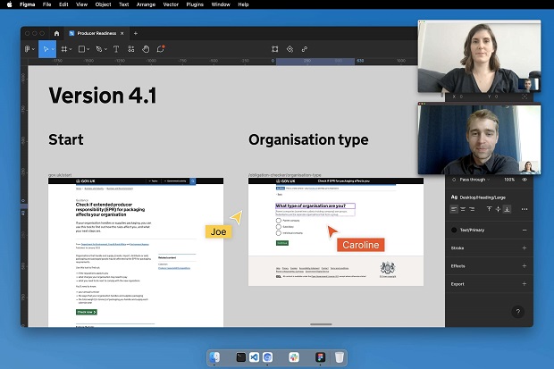
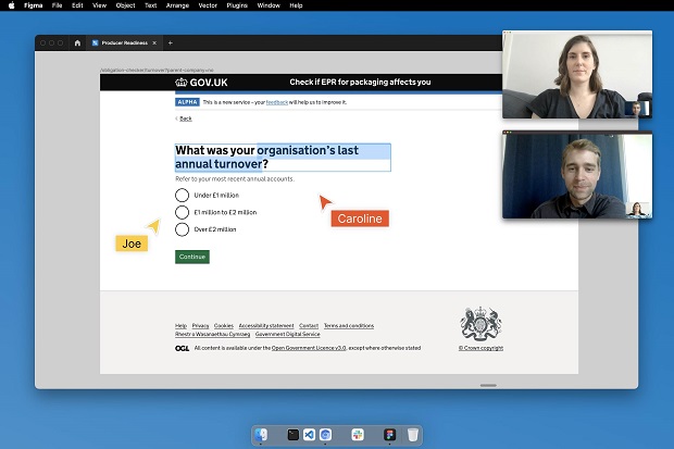
We found that getting together (in a virtual sense, as we live in different parts of the country) and designing in context was the best way to be creative and solve problems. We used the collaborative interface design tool Figma as our preferred tool, as it meant we could both work on a design at the same time.

For Caroline, being able to design content in context is vital:
“I’m a fairly tech-savvy content designer (lots of us are!). I can use the GOV.UK prototype kit, know a fair amount of HTML, and am a bit of a magpie when it comes to new tools. And thanks to Joe, I’m also now a big fan of Figma.
"As there are usually so few words on a service (compared to long form content like guidance pages), choosing and arranging those words within the context of the wider page and user flow is really important.
"After all, we are content designers, not content writers. So being able to work on the content alongside Joe was great. We could discuss everything as we did it - where things should be placed on a page, whether we needed to ask the user another question, or use a component from the GOV.UK design system to serve the needs of the user better.
"In the past I’ve designed content in a word document and handed it to the interaction designer to ‘drop in’ to the prototype. I now realise that doesn’t allow for much creativity, and can ultimately lead to a design that feels quite flat.”
For Joe, working collaboratively is key:
“In every service I’ve worked on as an interaction designer, I’ve been able to convert my content designer teammate to using Figma as our primary tool for collaboration and design. I’ve been fortunate enough to work with some fantastic content designers, Caroline being the most recent.
"From my experience working on services across government departments, I often get the impression that content designers are thought of as the ones who write, while interaction designers are thought of as the ones who design.
"In my eyes, content designers are as much designers as interaction designers are. But the key difference between the two is that the content designer specialises in words, and we specialise in interactions. When you frame the professions in this way, you’d think it would be mad for them to work separately. But I’ve seen this happen quite often.
"For me, working together with a content designer gives me a greater insight into how they design content. And because we both explain our decisions to each other as we collaborate, we end up with a deep understanding of every element on the screen - whether it be content or interaction specific.”
How collaborative design can solve problems
Design is actually something very simple - it’s a way of solving problems. During the five months we spent working together we designed and prototyped a tool that will tell users if and how they will be affected by new regulations.
During one of our design sessions we spent a couple of hours trying to incorporate something new into the tool.
Caroline remembers the moment well:
“I remember this particular session as being really interesting because it was the first time I’d properly understood the beauty of design.
"We spent ages trying to incorporate something new into the design and just couldn’t work out how to do it without really confusing users. Eventually Joe came up with the idea of using a component from the design system backlog called an interruption card. An interruption card pauses the user’s journey, so you can give them some important information that will help them to complete the task. We decided to give this a try and by the end of the session we had a new iteration of the prototype ready to go.
"We’d made so much progress in just a couple of hours. Neither of us could have got there on our own. Without Joe’s understanding of the design system and my content designer perspective coming together, we would have struggled to find a solution.
"I remember Joe saying that was the reason he loved design - because it’s a way of solving problems. I’d never thought of it in that way before. It’s quite satisfying to think of yourself as someone who spends their time at work solving problems.”
Finding the right tools
For interaction and content designers, it’s worth thinking about the tools that will best aid collaborative design as well as the tools you have access to. This could depend on the department you work in, or the device you’re working on.
At the start of our project we got together to decide which tools we were going to use to collaborate. We’d recommend other designers do the same. Flexibility is key. If your content designer can’t access your favourite tool due to device restrictions, consider using something else you can both work in.
We also found that working remotely was not a barrier to collaborative design. In fact, being able to jump on a video call at short notice really helped us work together.
There are lots of tools out there that aid collaborative design, such as Mural, Miro, Sketch, and Figma.
We found Figma to be the best option for us during the prototype phase, as it meant we could collaborate in real time. It’s also accessible via a browser, so great for someone working on a more restrictive device.
Joe likes to use Figma for prototyping for a few reasons:
“Designing on the spot together can be quite challenging. With every idea, sketch or design you think of, you need to not only communicate it effectively to your fellow designer but also justify the reasoning behind it.
"Working in Figma makes this sort of collaboration easy. Making use of the GOV.UK Figma library, I can turn ideas into high-fidelity designs in a matter of seconds. Seeing our designs in the context to which our users will see them allows us to critique them more meticulously. We can also both easily understand what the other is intending with their design ideas.”
Whichever tool you use, being able to work together in real-time and easily explain your decisions to each other will help you to design better collaboratively. And better design means better outcomes for our users, which is the main purpose of our work!
This is the fifth in our content design skills series, edited by Anna Scott. You might also be interested in our previous posts:
- How mountain bike guiding makes me a better content designer
- User research techniques for content designers
- Moving from social media to content design: transferable skills and attitudes
- Working well with subject matter experts: 6 tips for content designers
Caroline Vickers is a Senior Content Designer at Defra, and Joe Horton is a Senior Interaction Designer at Defra.

Recent Comments